Data used in the project is derived from the DataMaster IPEDS project. Details of the project can be found at: Youtube.com and Tableau Public
Higher education have been touted by many as the ticket to prosperity, especially the higher education industry. But for many years, the industry was not able to provide measurable evidence of the benefit provided by specific higher education institutions. On the surface, people heard of stories and believes elite schools are 'likely' to provide more benefits.
The US Department of Education were on the mission in trying to provide American parents and students measures the were intended to help families in choosing schools that provided good values for their investment in the higher education. The College Score Card data is exactly aimed at that goal.
In the past, the College Score Card, has published salary data by schools. Unfortunately, the data would not distinguish the values of different field of studies. Since institionss have very different mixes of colleges, or field of studies, the published salary data were likely to reflex the composition of the institution instead of the value of the institution.
This year (2019), the November 20's update to the Score Card data, for the first time, were able to provide salary data by the field of studies, granted only the salary earned one year after graduated from college.
While the data is very useful, the web tool provided is a bit difficult for consumer to see the big picture. It is the goal of this article to provide user a different way of using the data.
For beginner, the Field of Study is classified by what we called the CIP code. The CIP code is used to classify degree programs into various categories. There are many CIP codes and, therefore, the categories. Each detailed category were given a 6-digits CIP code. Similar categories are then grouped together and are given a 4-digits CIP code. For now, the published salary data is at the 4-digits code level.
There are several way of using the tools provided below. To see the big picture, we can begin with Figure 1 by selecting the (All) for both the 2-digits and 4-digits CIP codes. This will show the overall salary data provided by ScoreCard dataset. For the histogram, you and see that of all the program data provided by the ScoreCard, there are 1,711 program that will earn their graduates about $27,000 for the first year after graduation. At the high-end, you can see that there are 4 programs that will earn their graduates about $114,000 for the first year.
Once we see the over all picture, we can dive into each of the 2-digits CIP code branches. Let's leave the 4-digits CIP with the (All) selection and just select the 2-digits CIP code one by one. This will allow us to get a general sense of the market value of each discipline.
In the case that if you were looking at a particular school, you can obtained the salary of your school from College Score Card's web site and put it in the context of the Figure 1.
One drawback of the Figure 1 is that it is hard to compare various 2-digits CIPs in order to come up with some extractions. To facilitate that, the author has provide some general observation at the end of the article beginning with Figure 3 below.
Figure 1, the Salary Range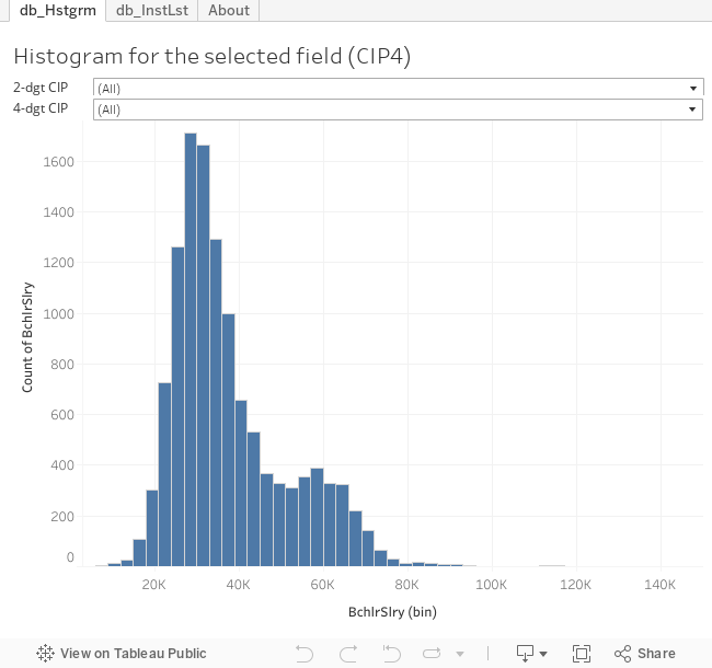
If you were looking at the Figure 1 and were wondering who were those schools that provided high salary earning, you can use the Figure 2 below to find out.
First, you select the 2-digits CIP, and then the 4-digits CIP. You can then use the salary bin dropdown to select the salary. Once you did that, you will see a list of schools that fall inside that salary range.
Figure 2, the List of Institutions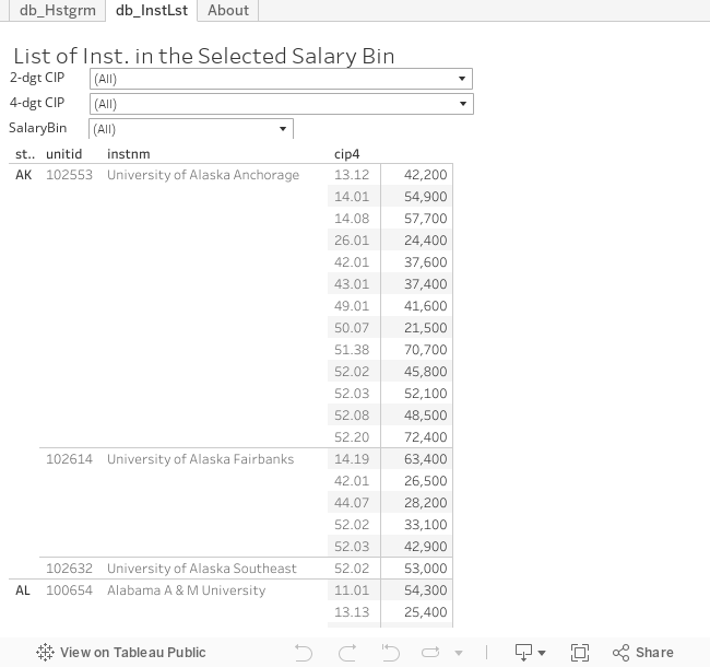
As we all know that STEM is a heated topics in many economic development and higher education discussions. From the salary point of view, the suspicion is that STEM graduates get paid well. However, if we look at Figure 3 carefully, we understand that there are a lot of myth surrounding that perception.
First of all, the original idea of STEM is to identify field, knowledge, or trainings that are essential for the US to stay competitive in the knowledge centered global economics. This idea does not necessarily meet by the real world economics of supply and demands. The other problem of the STEM is the designation of fields. These days, almost any field that can remotely tied to the original idea were given the STEM tag by various 'researchers'. In figure 3, we do take the liberal route that included many 'STEM' fields. Of cause, our purpose is simply to show salaries comparison.
From Figure 3, we can easily see that, in general, engineers got paid well followed by one branch of the health field along with 'information service' and 'engineering technician'. One interesting observed is that the health fields actually broken into two humps - the higher humps are pretty much correspond to the registered nurses and the other hump are much of administrative, nutrition and other services. Looking at other components in the STEM designation, they aren't doing as well. Other components leaded by the mathematician, then the 'physicist chemists' and followed by the social scientist, the second branch of the health field and, then, the biologist.
Figure 3, summary for STEM fields
Liberal Arts and Humanities graduates are constantly been considered the opposites to the STEM graduates. However, as to the first year salary, most liberal arts were paid compatibly to physicist and chemist.
Figure 4, Humanities and Liberal Arts
Besides the STEM and Liberal Arts fields, there are few fields that are well established and worth to take a look at. These are the business, the education, the visual/performance arts, and the agricultural related fields. Comparing to STEM fields, the business graduates got paid relatively well comparable to that of mathematician. The education graduates got paid comparable to that of physicist, followed slightly by the agricultural graduates. Compare to all fields we have discussed, the visual/performance artist probably paid the least, where the peak located.
Figure 5, Some major fields
Figure 6 shows some other fields that have relatively more data (i.e. more inst. provided the training). Within those, Architects doing relatively well.
Figure 6, fields with relatively more data
The rest of fields are shown in Figure 7 and 8. The number of data points presented in the ScoreCard are low - may just because few students are in those fields and the US Education department can have enough data to insure the data is statistically sound.
Figure 7 and 8, fields with relatively less data

=================


